A blog about free research software, alternative to commercial paid software.

One way to help people is to share your knowledge with those who could benefit from it. As a researcher , constant effort to solve scientific problems have exposed me to various scientific resources that can be accessed free of charge. Especially these knowledge is useful to labs and institution unable to access expensive software or novice users due to lack of expertise. In this blog, I have provided a comprehensive list of freely available softwares, alternative to commercial software. I shall share with you all that I have learned, as I make the changes or learn something new, I shall document them. Hope this blog will help those finding the way………….

Research software and books

Showing posts with label Excel. Show all posts

Dec 25, 2010

Non linear regression


The relationship between two variables is linear if the graph of the relationship is a straight line and the equation of the relationship is of the form:

                                           Y=MX + C

If the relationship between x and y can't be described by the equation of a straight line then the relationship is nonlinear. Nonlinear regression analysis is a form of regression analysis in which experimental data  (X and Y variable) is fitted using nonlinear model

 
There are many commercial software packages that perform non-linear regression analysis, but you can obtain the same results very easily by using the Solver (Excel Add in). When applied to the same data set, the Solver gives the same results as commercial research software packages. The reason I  opted to write about a commercial software like excel for statistical analysis is that microsoft windows is still by default given as operating system when you by a new computer in many countries.

The following example illustrates the ease with which the Excel,s Solver can be used to perform non-linear least-squares curve fitting. For clarity here I will analyze enzyme kinetic data using the Michaelis-Menten equation. For those of you not from biochemistry background, just need to know that Michaelis-Menten equation has a general form of rectangular hyperbola. 
Vmax and Km are constants. So here the x variable is V and y variable is S. Type your data into blank excel spread sheet.

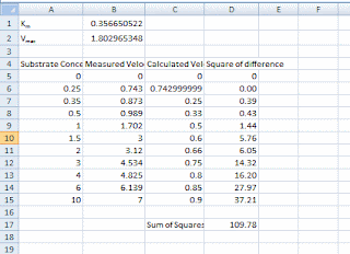
Select cell A1 and type Km= and press enter. Type Vmax= and then select cell B1. The B1 will contain the value for Km as mentioned above we will use a random number so type 1 and press enter. Type 1 again and this will be your Vmax. If you fill your data similar to the next picture then you can follow the step by step instructions.


To calculate the calculated velocity select the C6 and type “=” then select the value of Vmax (cell B2), type *, select the corresponding substrate (cell A5), type /, open parenthesis, select the value of Km (B1), add the substrate concentration and close the parenthesis. To keep the position of the Km and Vmax values constant add the $ sign before the column and the row number so instead of B2 you will have $B$2. Hit enter. Select the calculated cell and move the mouse pointer to the right bottom corner, when the pointer turns into a cross push the mouse left button and pull it down to calculate the rates for the rest of the substrate concentrations.

Plotting experimental and calculated data on one plot

Visualize the data you will plot both series on one plot


Select the date columns A to C and corresponding rows depending on how many substrate concentrations you have and hit the plot button on your toolbar ,select chart type scattered and click next. Follow the rest of the chart wizard steps to finish the plot if you wish to rename the series you may do so. Once the plot is ready double click the data series that corresponds to calculated velocity (when you click on the data series the corresponding columns and rows are highlighted) and change the marker format to none and line format to custom. Your plot should look similar to the plot below.


Calculating difference


Calculate the difference between the measured and experimental velocities. You can use the excel formula POWER to calculate the square of the difference. Your screen will look similar to the following picture.


Calculating Km and Vmax

Select the cell which contains the sum of the square differences and choose solver from the Tools menu. Your screen will look similar to the following picture.


As you can see the target cell is set to the sum of the square difference and it will be minimized by changing the cells which contain the random values of Km and Vmax.

Select Solve, solver will pose after first approximation and you will need to click on continue button. When the last iteration is done you will note that the calculated curve if fit to your measured velocities and the Km and Vmax are changed. 


>> continue reading: Linear regression with excel.

Linear regression using Excel

To do advanced statistics in excel you have to make sure that Analysis Toolpak Add-in is installed. Assuming that it is not installed,the following needs to be done;

  • Run Microsoft Office Setup to add components to MS Office
  • Select Analysis Toolpak under the Excel group of software items.
  • Once this is done
  • Run Excel
  • Select Addins in the tool menu. ( In EXCEL 2007 Add-ins tab is in the excel option dialogue box). In the dialogue box select Analysis Toolpak and then click on the OK button.
Now you have an extra command, Data analysis on the Tools Menu and you can do the statistics.To do advanced statistics in excel you have to make sure that Analysis Toolpak Add-in is installed. Assuming that it is not installed,the following needs to be done;

  • Run Microsoft Office Setup to add components to MS Office
  • Select Analysis Toolpak under the Excel group of software items.
          Once this is done
  • Run Excel

Select Addins in the tool menu. ( In EXCEL 2007 Add-ins tab is in the excel option dialogue box). In the dialogue box select Analysis Toolpak and then click on the OK button.

Now you have an extra command, Data analysis on the Tools Menu and you can do the statistics.


Linear, non-weighted regression


Type your data into blank excel spread sheet.


Now select the data analysis command on the tools menu (Data menu in excel 2007). This will give you dialogue box as shown below, listing all the data analysis facilities that are available. Select Regression and click on the OK button. This will give you a dialogue box full of options.


 Place the cursor in the input range control and then use the mouse to select on the spreadsheet the data you want to analyse. This should enter the appropriate cell reference in the control.
 

Label in first row check box tells the tool to use the labels in the top row of the data to label some of the statistical values. If you haven’t used labels leave this unticked.


  • Tick the confidence level check box and enter appropriate values.
  • Select the new worksheet ply.
  • Select residual plot.
  • Click on the OK button.

Excel will do all the calculation and present the results in a new ply.  Lets go through the results step by step:


The slope (m) is the X variable 1 in our case it is 7.05714 x 10-05 . However if you look along the row you will see 95% confidence limits on m- there is 0.95 probability that m lies between 5.85107E x 10 -05 and 8.26322E x 10-05 . The coefficient c in our equation of straight line is 0.002496 with upper and lower 95% confidence limits of 0.00069 and 0.00429.


Correlation coefficient

R = 0.9856. R represents how closely x variable and y variable vary together .

>> continue reading: Excel can also be used for non- linear regression analysis using the solver add in.


Descriptive Statistics

when you acquire a set of numbers you would want to examine the data to find out distribution, maxium and minimum values outliers etc. This is an important part of data analysis, since it helps you to know if you data meet assumptions required by other analyses such as t-test. For this example, we’ll look at the given below table.


In Excel, select Tools/Data Analysis/Descriptive Statistics. (If the Data Analysis option is not on your Tools menu, you must first install it using Tools/Add ins…).
 
Assuming that it is not installed,the following needs to be done;
  •     Run Microsoft Office Setup to add components to MS Office
       
  •     Select Analysis Toolpak under the Excel group of software items.

         Once this is done

  • Run Excel
  • Select Addins in the tool menu. ( In EXCEL 2007 Add-ins tab is in the excel option dialogue box)
      
  • In the dialogue box select Analysis Toolpak and then click on the OK button.

Now you have an extra command, Data analysis on the Tools Menu and you can do the statistics.


Select the input range. In this case it is $A$1:$A$10.


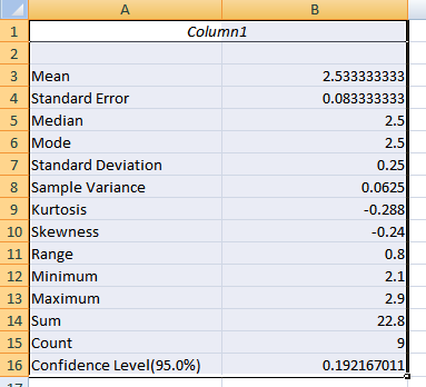
Be sure to select the check boxes Summary Statistics and Confidence level for mean (95% is okay). The output created is shown here:


Information you should notice includes:

Symmetry:

The Skewness measure indicates the level of non-symmetry. If the distribution of the data are symmetric then skewness will be close to 0 (zero). The further from 0, the more skewed the data. A negative value indicates a skew to the left. How do you tell if the skewness is large enough to case concern. Excel doesn’t give you this value, but a measure of the standard error of skewness can be calculated as =SQRT(6/N) or =SQRT(6/9 which is 0.816. If the skewness is more than twice this amount, then it indicates that the distribution of the data is non-symmetric. In this case 0.816 * 2 = 1.69. The skewness reported by Excel is -0.214 so the data can be assumed to be fairly symmetric. However, this does NOT indicate that the data are normally distributed.

Kurtosis is a measure of the peakedness of the data. Again, for normally distributed data the kurtosis is 0 (zero). As with skewness, if the value of kurtosis is too big or too small, there is concern about the normality of the distribution. In this case, a rough formula for the standard error for kurtosis is =SQRT(24/N) = 1.63 .Twice this amount is 3.2. Since the value of kurtosis falls within two standard errors (-0.28) the data may be considered to meet the criteria for normality by this measure. These measures of skewness and kurtosis are one method of examining the distribution of the data. However, they are not definitive in concluding normality.

Estimate of central tendency:

For normally distributed data the mean (arithmetic average) is the typical value to use in a report. The median is another measure of central tendency and is usually reported when the data are not normally distributed. The mode, or the most frequent value, is a third measure of central tendency.

Measures of variability:

The measures of variability reported in Excel’s descriptive statistics include the standard error, the standard deviation and the variance as well as the range. The first three measures are related in the following ways:

Standard Deviation = SQRT(Variance)

Standard Error = Standard Deviation / SQRT(N)

Coefficient of Variation:

Another measure often reported is the coefficient of variation. This measure provides a unitless measure of the variation of the sate by translating it into a percentage of the mean value. This measure not provided by Excel, but is easily calculated by the formula:

CV = (Standard Deviation / Mean) * 100

>>Continue reading: ANOVA with Excel, t-test with excel


Dec 22, 2010

ANOVA with Excel

To do advanced statistics in excel you have to make sure that Analysis Toolpak Add-in is installed. Assuming that it is not installed,the following needs to be done;

  • Run Microsoft Office Setup to add components to MS Office
  • Select Analysis Toolpak under the Excel group of software items.

        Once this is done

  • Run Excel
  • Select Addins in the tool menu. ( In EXCEL 2007 Add-ins tab is in the excel option dialogue box)
  • In the dialogue box select Analysis Toolpak and then click on the OK button.

Now you have an extra command, Data analysis on the Tools Menu and you can do the statistics.

ANOVA

Type your data into blank spread sheet.

Now select the data analysis command on the tools menu (Data menu in excel 2007). This will give you dialogue box as shown below, listing all the data analysis facilities that are available.

Select Anova: Single Factor and clickon the OK button. This will give you a dialogue box full of options.

You have to tell the tool where the data are, where to put the analysis and select various options.

Place the cursor in the input range control and then use the mouse to select on the spreadsheet the data you want to analyse. This should enter the appropriate cell reference in the control.

Depending upon whether the data is grouped as columns or Rows click on the appropriate values.

Label in first row check box tells the tool to use the labels in the top row of the data to label some of the statistical values. If you haven’t used labels leave this unticked.

Alpha refers to critical probability . It makes hardly any difference to the analysis Simply adds to the table of results f statistics.

Select the new worksheet ply and type in appropriate label.

Click on the OK button.

Excel will do all the calculation and present the results in a new ply.


Summary in the table represents summary statistics separately for each column. Following this is table labeled Anova that contains figures used for the significance test.

The P value in the Anova table above which contains the probability that the three column means are due only to random variation is important for coming up with a final conclusion. All the values are intermediate statistics. In single factor Anova the variation categorized into different source. So there is variation owing to imprecision within the group and between the groups.

Between groups

This is the variation between group means. The first step is the sums of squares of deviation of group means from the overall mean (SS=0.0144). Further the table show mean squares (MS=0.00722) which is the sum of squares divided by degrees of freedom (df=2).

Within groups.

This is the variation within group. The sums of squares values is simply the total for each of the individual block sums of squared deviations (SS=0.676).Mean square (MS=0.045) is the sums of squares divided by degrees of freedom (df=15).

Total

Is the sum of squares values that you already have.

f statistic

This is the mean square ration of ‘between’ to ‘within’. If f is big then variation between groups is high compared with within groups. An f value of 1.0 is expected if there is no significant difference between group means.

P Value

This is the probability that the f value could have occurred because of random variation in the replicates. If P is below s chosen threshold (often 0.05), then you accept that there is different accuracy occurring between different sets of measurement . In the above test P = 0.85 which is greater than 0.05 so there is no significant difference between groups.

F crit

This is the critical f value. It is the f value that would give a P value of 0.05.