The relationship between two variables is linear if the graph of the relationship is a straight line and the equation of the relationship is of the form:
Y=MX + C
If the relationship between x and y can't be described by the equation of a straight line then the relationship is nonlinear. Nonlinear regression analysis is a form of regression analysis in which experimental data (X and Y variable) is fitted using nonlinear model
There are many commercial software packages that perform non-linear regression analysis, but you can obtain the same results very easily by using the Solver (Excel Add in). When applied to the same data set, the Solver gives the same results as commercial research software packages. The reason I opted to write about a commercial software like excel for statistical analysis is that microsoft windows is still by default given as operating system when you by a new computer in many countries.
The following example illustrates the ease with which the Excel,s Solver can be used to perform non-linear least-squares curve fitting. For clarity here I will analyze enzyme kinetic data using the Michaelis-Menten equation. For those of you not from biochemistry background, just need to know that Michaelis-Menten equation has a general form of rectangular hyperbola.
Vmax and Km are constants. So here the x variable is V and y variable is S. Type your data into blank excel spread sheet.
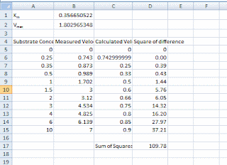
Select cell A1 and type Km= and press enter. Type Vmax= and then select cell B1. The B1 will contain the value for Km as mentioned above we will use a random number so type 1 and press enter. Type 1 again and this will be your Vmax. If you fill your data similar to the next picture then you can follow the step by step instructions.
To calculate the calculated velocity select the C6 and type “=” then select the value of Vmax (cell B2), type *, select the corresponding substrate (cell A5), type /, open parenthesis, select the value of Km (B1), add the substrate concentration and close the parenthesis. To keep the position of the Km and Vmax values constant add the $ sign before the column and the row number so instead of B2 you will have $B$2. Hit enter. Select the calculated cell and move the mouse pointer to the right bottom corner, when the pointer turns into a cross push the mouse left button and pull it down to calculate the rates for the rest of the substrate concentrations.
Plotting experimental and calculated data on one plot
Visualize the data you will plot both series on one plot
Select the date columns A to C and corresponding rows depending on how many substrate concentrations you have and hit the plot button on your toolbar ,select chart type scattered and click next. Follow the rest of the chart wizard steps to finish the plot if you wish to rename the series you may do so. Once the plot is ready double click the data series that corresponds to calculated velocity (when you click on the data series the corresponding columns and rows are highlighted) and change the marker format to none and line format to custom. Your plot should look similar to the plot below.
Calculating difference
Calculate the difference between the measured and experimental velocities. You can use the excel formula POWER to calculate the square of the difference. Your screen will look similar to the following picture.
Select the cell which contains the sum of the square differences and choose solver from the Tools menu. Your screen will look similar to the following picture.
As you can see the target cell is set to the sum of the square difference and it will be minimized by changing the cells which contain the random values of Km and Vmax.
Select Solve, solver will pose after first approximation and you will need to click on continue button. When the last iteration is done you will note that the calculated curve if fit to your measured velocities and the Km and Vmax are changed. 


0 comments:
Post a Comment